How to create a website using WordPress/How to use plugins/No-code construction blog

Create a mega menu with the free WordPress theme Ocean WP
At HanamiWEB Online School,
●Ask questions in real-time in the virtual study room!
●Ask as many questions as you want via chat!
●E-learning materials that you can learn as much as you want, 24 hours a day!
All included for just 2,500 yen/month!
The theme is called OceanWP and is made overseas, but the settings screen is in Japanese and there are many things you can do with it, so I think it's very easy to use.
This time, I will explain how to create a mega menu using the OceanWP theme. Normally, it is a drop-down submenu, but now it will have a submenu on the side.
Mega menus that can be implemented
OceanWP's default submenu is output as a vertical dropdown.

When you turn on the mega menu setting
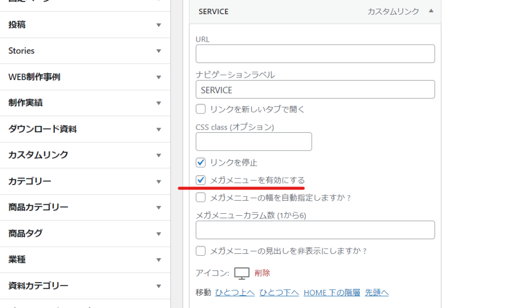
Menu Settings
[Appearance] > [Menu]
In the advanced settings of the parent menu you want to turn into a mega menu, check "Enable mega menu."

This will create a default two-column mega menu.

Specify the number of columns for the mega menu
OceanWP allows you to set up 1-6 columns.
What is a one-column mega menu?
I was curious about what it meant to set up a mega menu in one column, so I decided to implement it.
I found that it was no different from a normal drop-down format (it was wider than normal).

Mega menu with 6 columns
Since there were exactly six submenu items, I set the number of columns to 6.
It feels a little cramped.

Mega menu set to 3 columns
Three columns seemed like a good size. However, I needed to adjust the number of characters and make adjustments so that there were no menus that were two rows long.

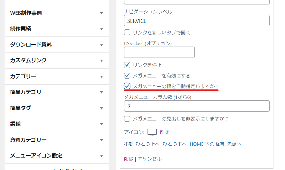
Mega menu width adjustment
By default, it is set to fill the content width.
Check [Auto adjust mega menu width?] to set the width automatically.

Since the width will be small, I don't think you need to set [Auto-specify mega menu width?].

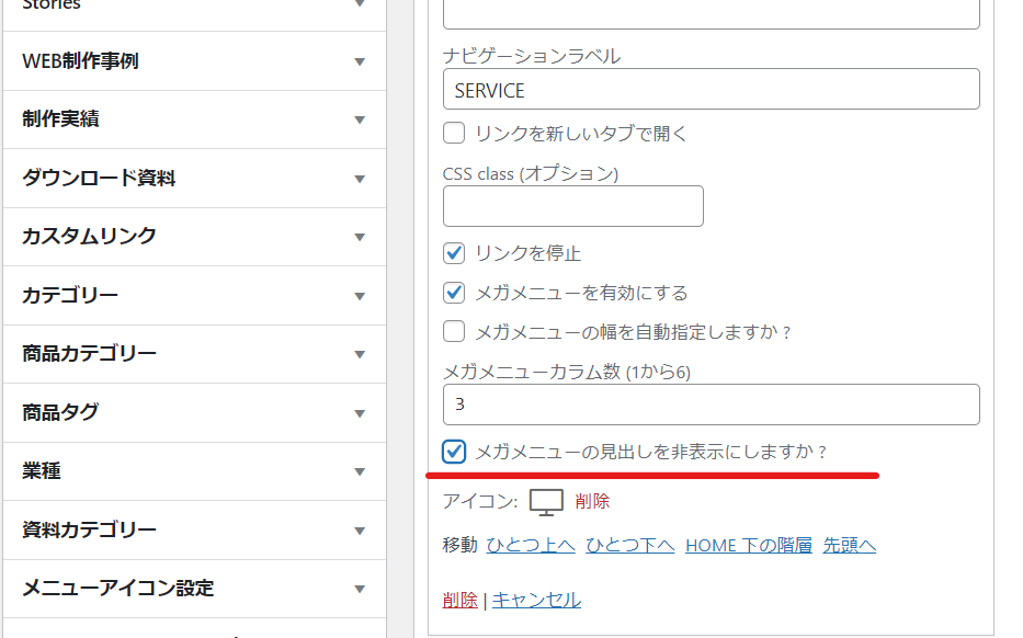
What is Hiding Mega Menu Headings?
The next thing that caught my attention was the setting "Hide mega menu headings?".

Nothing came out anymore.

Customizing with CSS
When the layout was two-tiered, there was no boundary between the first and second tiers, which made it difficult to understand, and I wanted to make the vertical width wider, so I added the following CSS.

.navigation li.megamenu-li .megamenu.col-3>li { border-bottom: 1px solid #f1f1f1; height: 40px; }Here is the mega menu after adjusting the text volume of the menu items and adding some CSS.

Released as soon as the next morning! Weekends and holidays are also available!
Super rush website creation plan
We offer a rush website creation plan for those who need a website in a hurry!
We can publish your content as soon as the next morning, even on weekends and holidays! If you have any questions, please check the details below!
Latest Articles


